Vertical Screens
Displaying your app in portrait orientation
Before continuing to read this post, please make sure you understand the risks of vertical video syndrome .
Now that we’ve got that out of the way, perhaps you’re interested in using Senza to provide content to a TV that’s mounted vertically, such as for digital signage applications. Like 90° to the right. Or 90° to the left. Or even upside down, because why not?
But you want your content to display right side up for your audience. This is not a problem. Video is going to be streamed into your TV and play right side up from the TV set’s point of view no matter how it’s mounted, and we can’t change that. But what we can do is a little CSS magic to rotate the content in the browser for you.
- Source code: https://github.com/synamedia-senza/vertical
- Demo: https://andrewzc.net/vertical/
The App
For this demo, we’re going to display a bunch of numbered squares that will flow inside their container just like text on a page. They’ll reconfigure themselves to title the screen regardless of whether it’s in portrait or landscape orientation. We'll do a neat little animation for the rotation, switching between landscape and portrait modes as we pass the 45° mark. Here are what the key frames of the animation will look like:
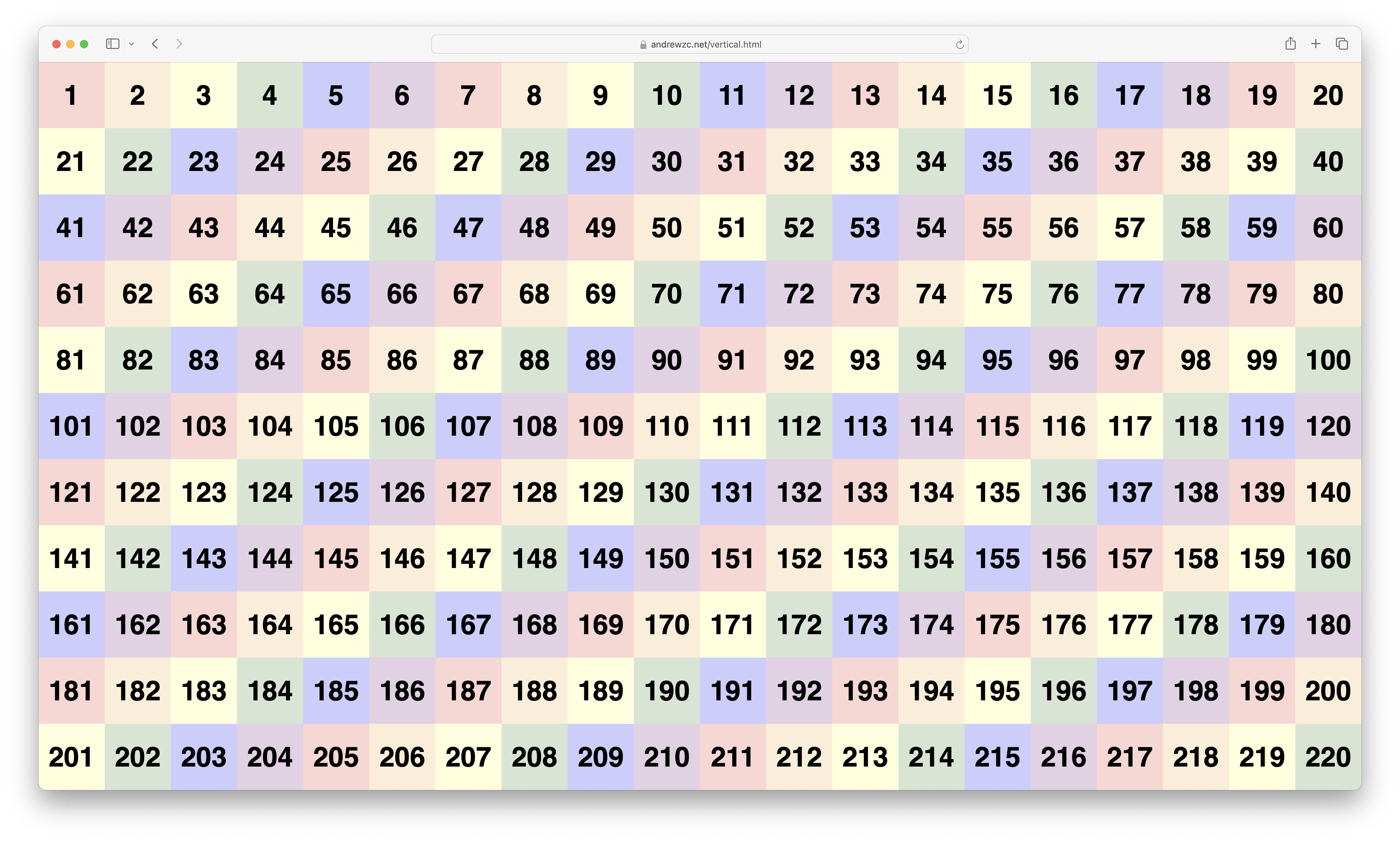
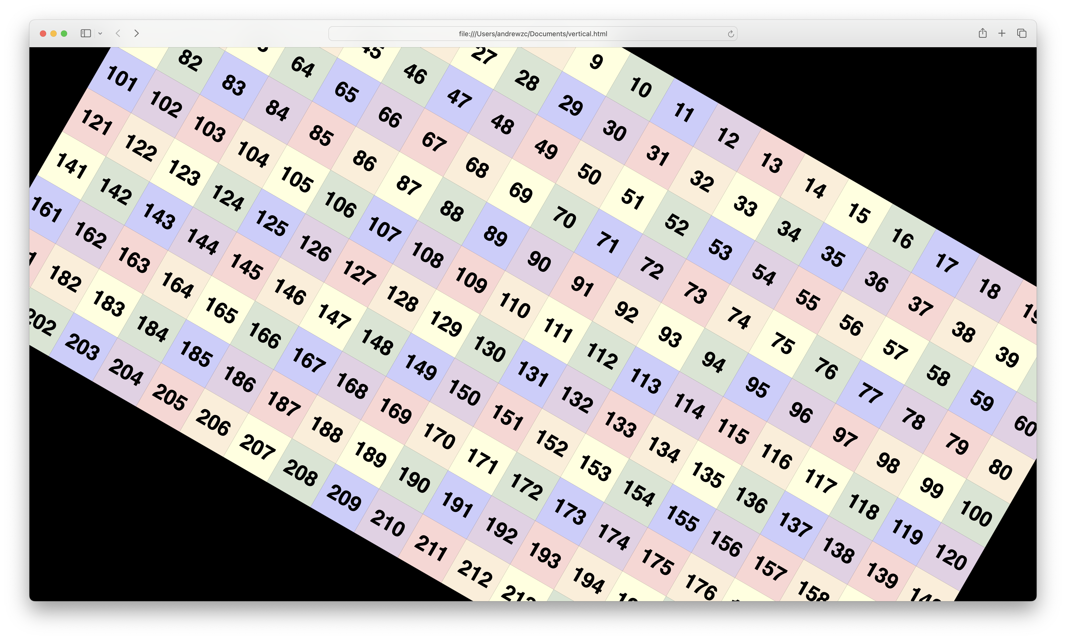
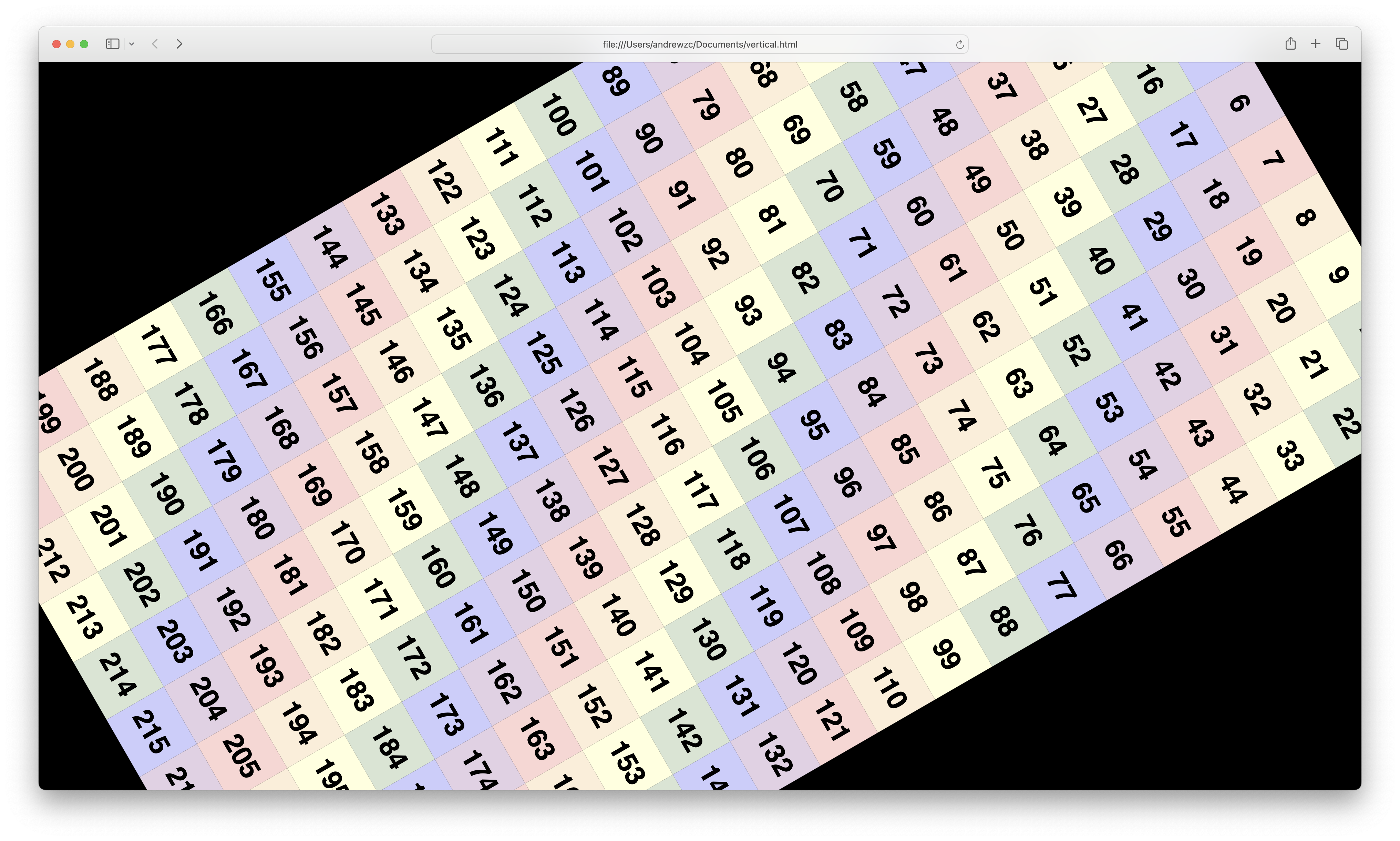
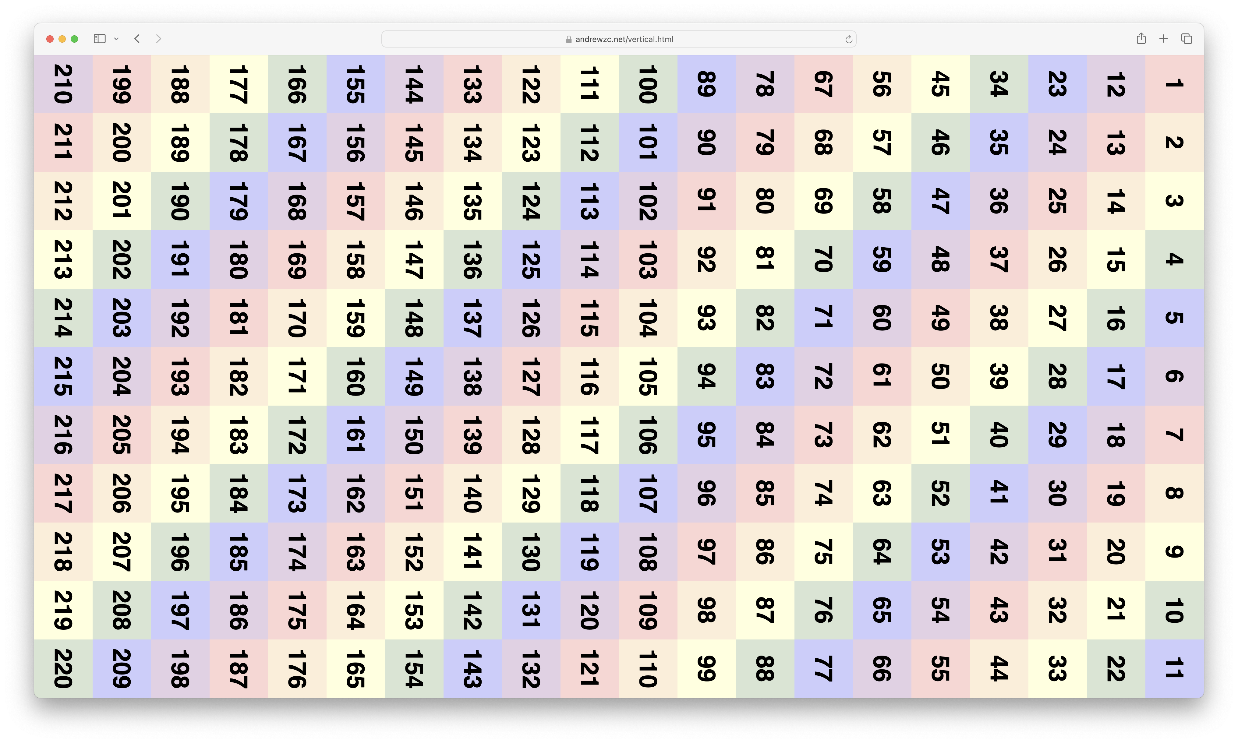
Rotating the content with CSS
Here are the four CSS classes that we can use to rotate our container in increments of 90°. If all you want to do is display your content sideways, you can stop reading here. Just grab the transform you need and off you go.
But if you want to see how we can use Senza to rotate the content with some fun animations, keep reading!
.orientation0 {
   width: 1920px;
   height: 1080px;
   left: 0px;
   bottom: 0px;
 }

.orientation90 {
  transform: rotate(90deg);
  width: 1080px;
  height: 1920px;
  left: 420px;
  bottom: 420px;
}

.orientation180 {
   transform: rotate(180deg);
   width: 1920px;
   height: 1080px;
   left: 0px;
   bottom: 0px;
 }

.orientation270 {
  transform: rotate(270deg);
  width: 1080px;
  height: 1920px;
  left: 420px;
  bottom: 420px;
}
Here's a little explanation of the math behind some of the figures. Our HD video signal is 1920px wide by 1080px high. We’ll start with 20 columns of 96px squares. That gives us room for 11 rows, with 24px of blank space left over at the bottom.
When displaying in portrait mode, we will need to shift our container by 420px down and to the left to account for the center point of the rotation not being where you would expect it to be. That number is half the difference between the width and the height of HD video.
The CSS code above is what you'll need in most cases where you're rotating an element that's exactly the same resolution as the screen, 1920 x 1080. Because the content in this video has a margin at the bottom of 24 pixels, we'll actually want to account for that by adjusting some of the dimensions slightly:
.orientation180 {
   bottom: 24px;
 }

.orientation270 {
  bottom: 444px;
}
Building the page
Let’s start with some very short HTML, basically just one div container.
<body>
<div id="main" class="orientation0">
</div>
</body>
We'll build the rest of the content programmatically, with some blocks to display in our container. We'll label them with consecutive numbers from 1 to 220, so you can see how the content flows when we change the orientation.
const width = 1920;
const height = 1080;
const block = 96;
const count = Math.floor(width / block) * Math.floor(height / block);
const main = document.getElementById("main");

function addBlocks() {
  for (let i = 1; i <= count; i++) {
    let div = document.createElement("div");
    div.classList.add("block", `color${i % 6}`);
    div.innerHTML = `<p>${i}</p>`;
    main.appendChild(div);
  }
}
addBlocks();
We’ll also color them by cycling through six background colors for a bit of a rainbow effect.
.color1 { background-color: #FBD6D3; }
.color2 { background-color: #FCEED8; }
.color3 { background-color: #FFFFDD; }
.color4 { background-color: #D7E5D3; }
.color5 { background-color: #CCCDFD; }
.color0 { background-color: #E3D0E5; }
See the appendix at the end of the post for the rest of the CSS.
Rotating the page
Now for the fun part. When we press the left and right arrow keys, we’re going to rotate by 90°. When we press up and down keys, we’ll rotate it by 180°.
For each arrow key press, we’ll call the function spin(), passing in the change in orientation. Here’s our listener:
let orientation = 0;
document.addEventListener("keydown", function(event) {
  switch (event.key) {
    case "ArrowUp": spin(-180); break;
    case "ArrowLeft": spin(-90); break;
    case "ArrowRight": spin(90); break;
    case "ArrowDown": spin(180); break;
    default: return;
  }
  event.preventDefault();
});
And here’s the spin() function:
function spin(delta) {
  let step = delta / 90;
  let from = orientation;
  let to = (orientation + delta + 360) % 360;
  orientation = to;

  let rotation = from;
  let count = 0;
  let interval = setInterval(() => {
    rotation += by;
    count++;

    main.style.transform = `rotate(${rotation}deg)`;

    if (count == 45) {
      main.classList.remove(`orientation${from}`);
      main.classList.add(`orientation${to}`);
    }
    if (count == 90) {
      clearInterval(interval);
    }
  }, 6);
}
We have a variable called orientation we’ll modify to store the current rotation in 90° increments, which is useful for switching between the four CSS classes above. First the function stores the orientation we’re rotating from, and then sets the global variable to the value we’re rotating to.
We call setInterval() to perform the animation. We’re going to use two counter variables, the rotation that is incremented or decremented, and a value that just counts the number of steps. In all cases, we’ll step through 90 frames with a gap of 6 milliseconds per frame. In each frame, we’ll override the transform style property with a custom rotation value.
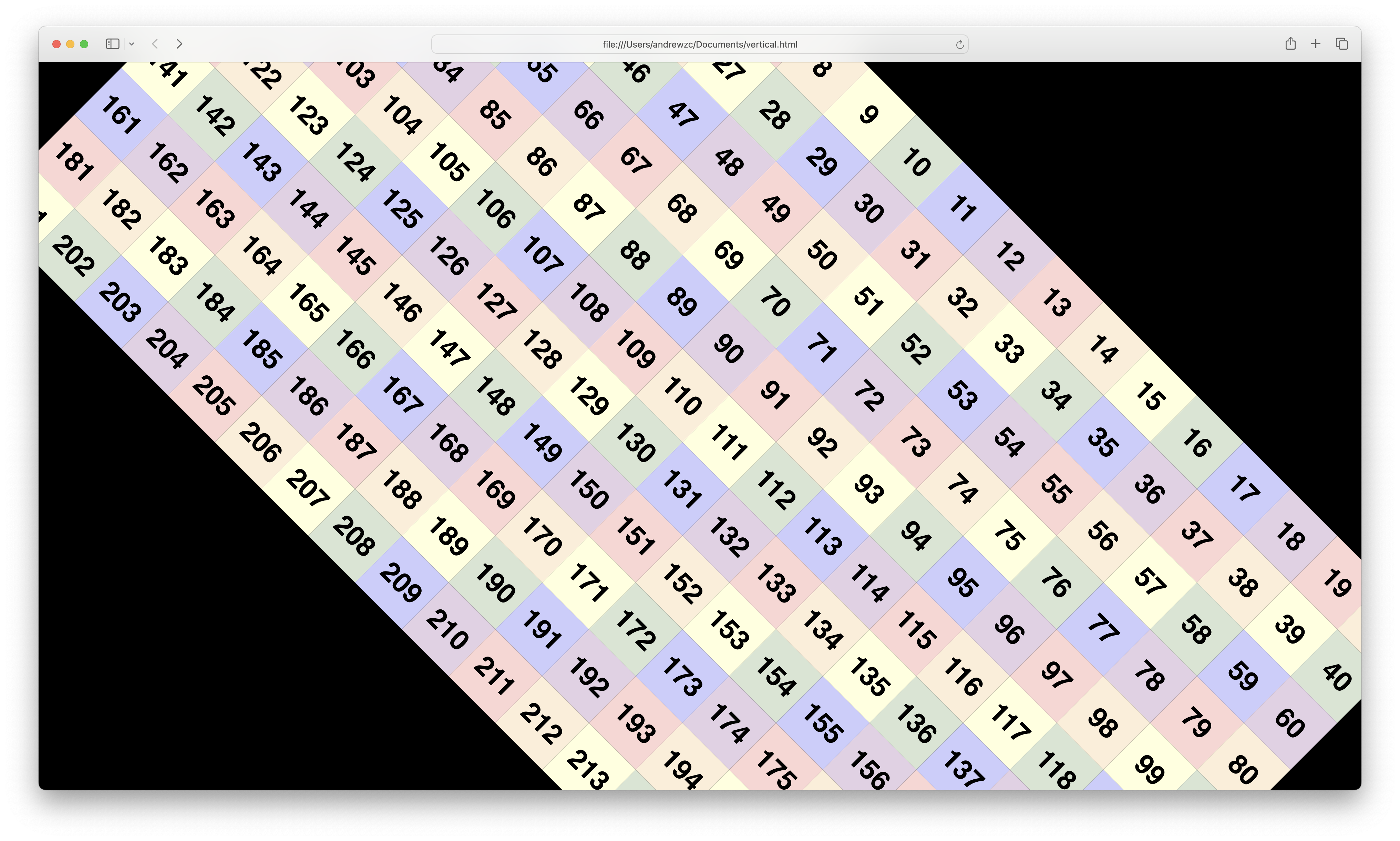
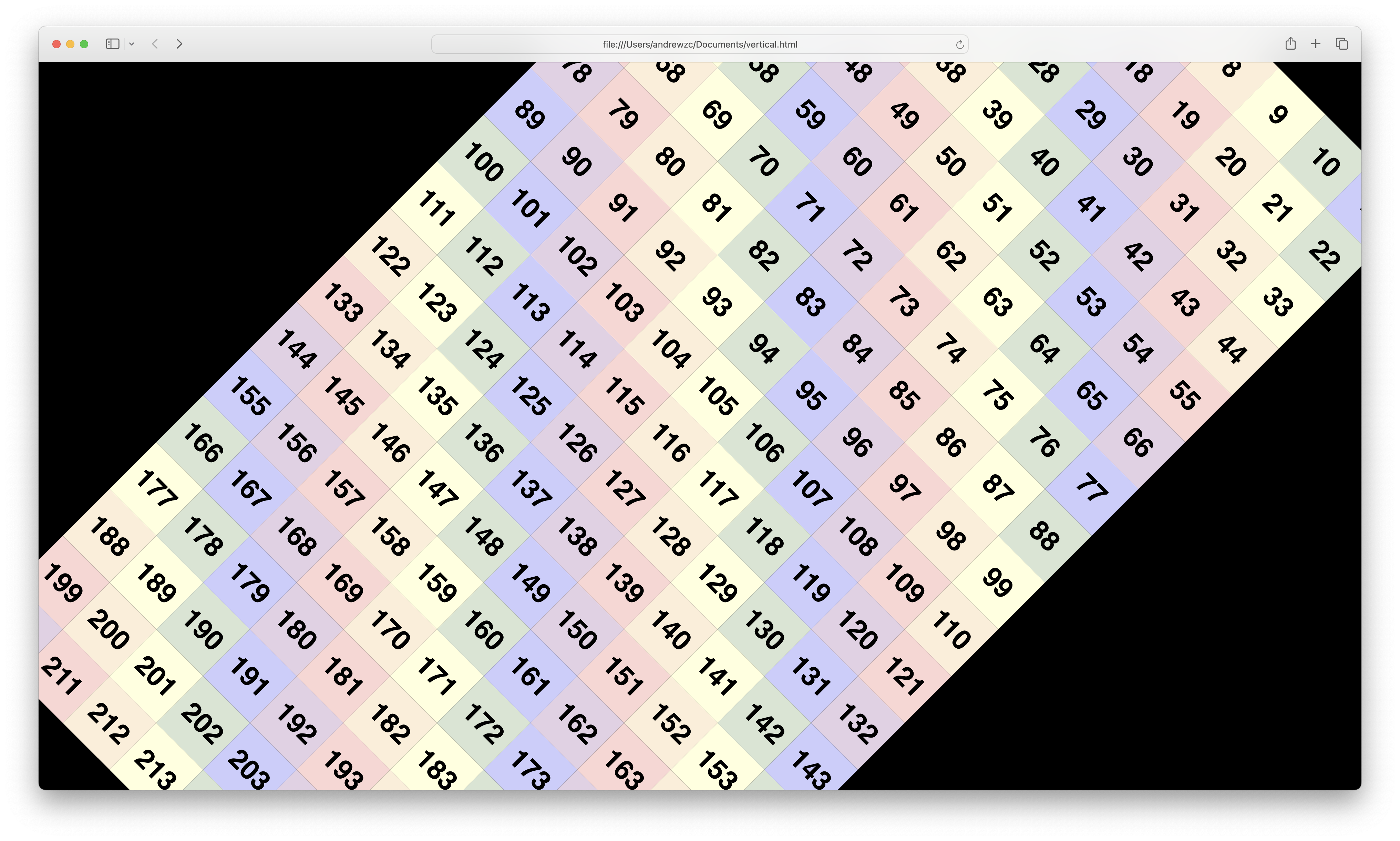
And with a little bit of user interface sleight of hand, when we’re halfway through a 90° rotation and the rectangle is balanced at a 45° angle, we’ll toggle between portrait and landscape modes by switching CSS classes. You might not even notice it happening because the corners of the rectangle extend offscreen at this moment. What you will see is that the numbers will reflow inside the div, and when the animation stops the rectangle will properly fit in the screen again.
Conclusion
That’s all there is to it. So go out there, mount some TVs on their side, and see what you can do in the world of streaming vertical video. Just remember: shoot vertical video when the subject calls for it (giraffes, skyscrapers), not because that's just how you happened to be holding your phone when you hit the record button!
Updated almost 2 years ago